Table of contents
- Table of contents
- The problem definition
- The user research
- The design solution
- The design process
- Reflection
The problem definition
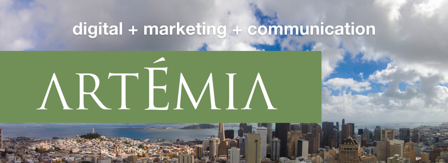
Dealing with digital agencies should be simple, pleasant and innovative. How to demonstrate that, showing its identity in a better way?
The client is a full-service agency with expertise in Digital Marketing and Strategic Communication. It provides B2B and B2C and it's based in San Francisco, CA.
The foundation for this project is based in user research and case studies.
My first priority was to make the website responsive, elegant and more interesting.
The user research
Real clients and potential clients.
I started with a survey and applied it to 13 people (including current clients, employees, and potential clients).
Goal: to discover the struggles while accessing the website and the expectations they have when navigating through it.
Here are the main topics I got from the survey:
A) Not a mobile-friendly website
91% of the interviewed got frustrated about not having a mobile-friendly website.
B) Old-school visual
95% of the interviewed didn't like the current design of the website.
C) Disorganized structure
87% of the users had struggles trying to find information about the company.
The design solution
A responsive and clean website, offering an innovative and elegant concept, matching with the agency identity (located in a heart of a high-tech city).
The design process
- Content: Working with the team, dividing the website by content, making it easier to navigate and to find topics.
- Creating a new layout: Showing an innovative design, responsive, clean and elegant. Ideal to access in multiple platforms.
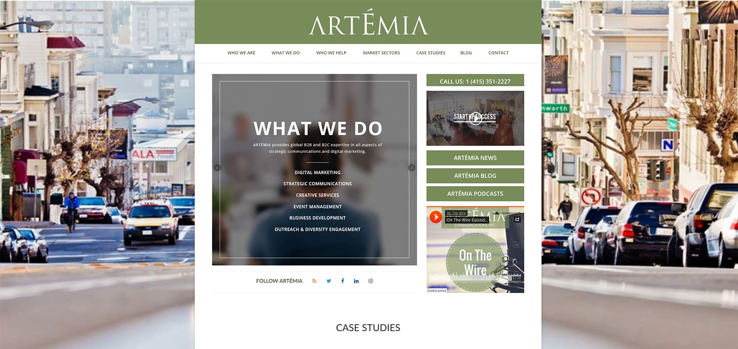
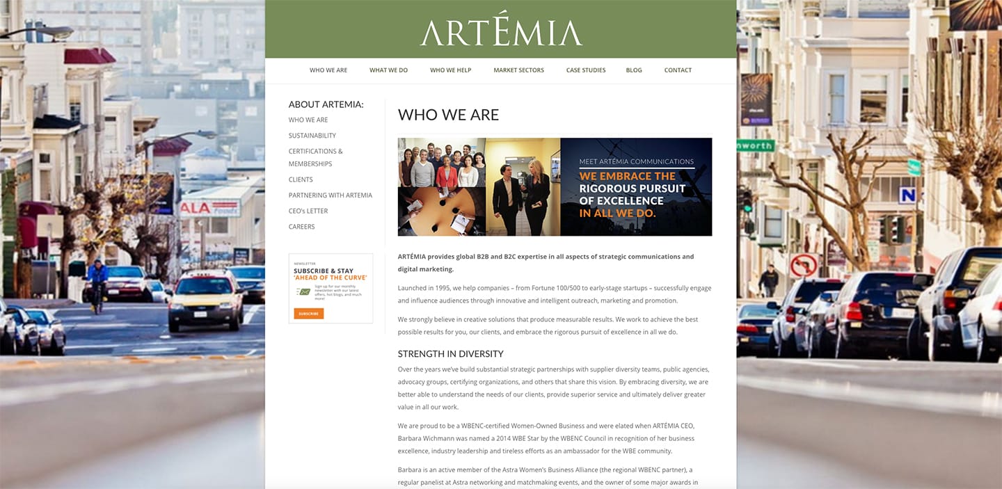
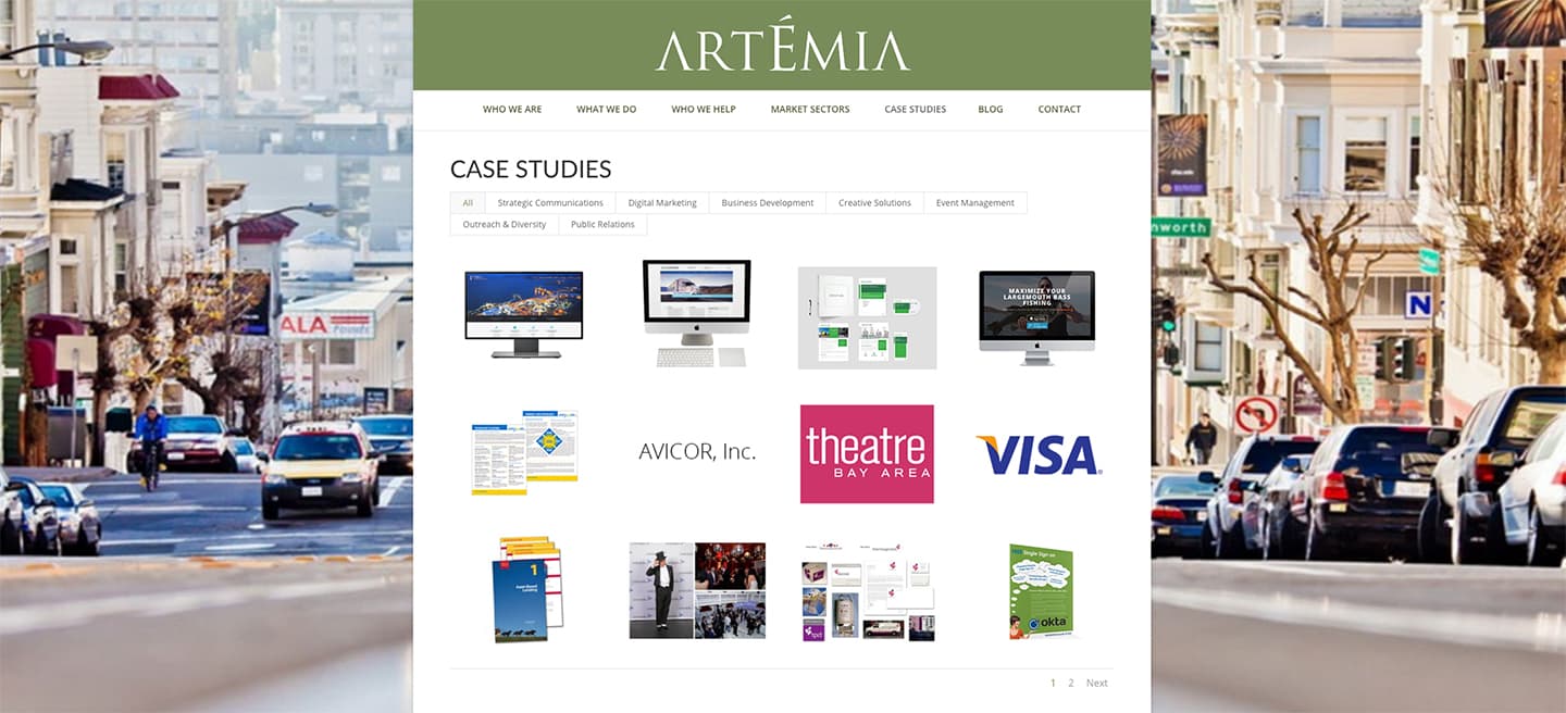
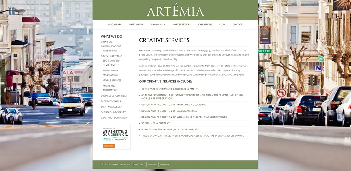
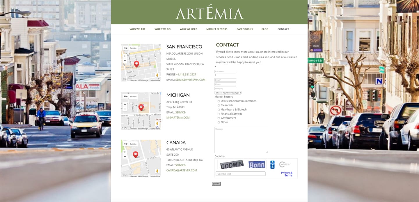
The current website
Home page
Who we are
Case studies
Creative services
Locations
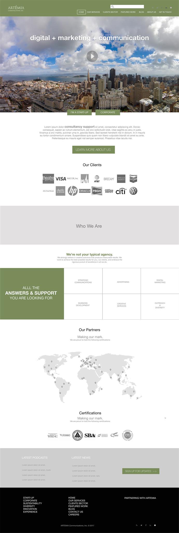
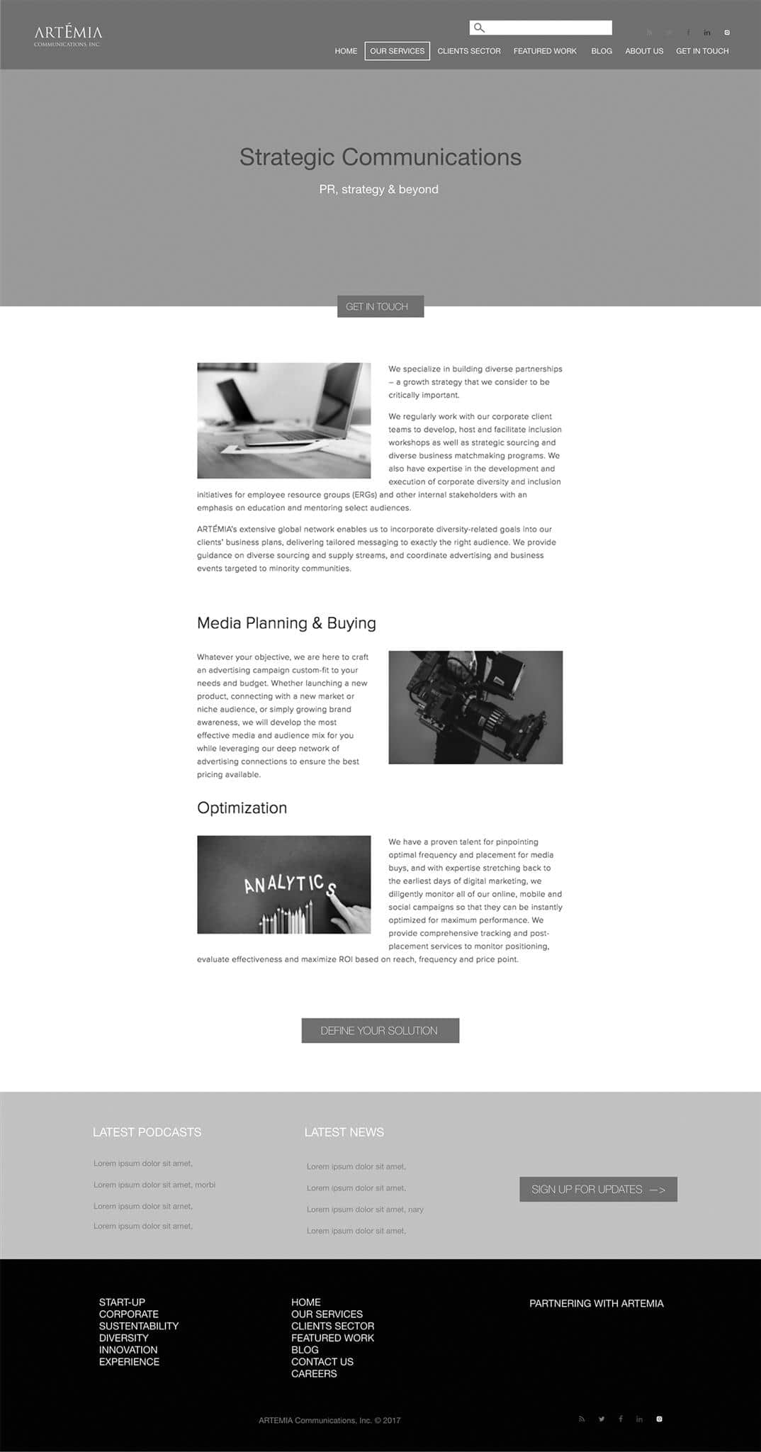
The proposal
After analyzing the data, I created mockups of the new website using Sketch to iterate through design quickly. Working with the project manager, we used the wireframes to discuss the redesign strategy.
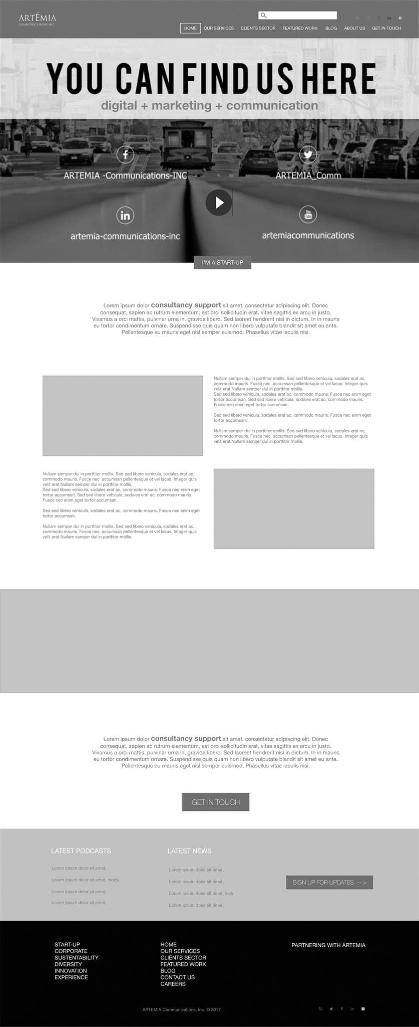
Home page
Our services
Find us here
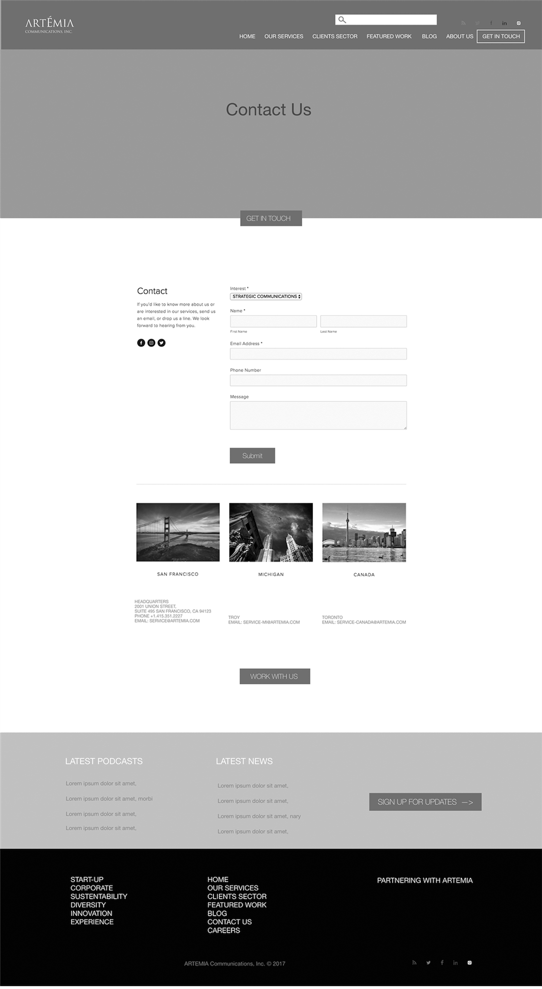
Contact us
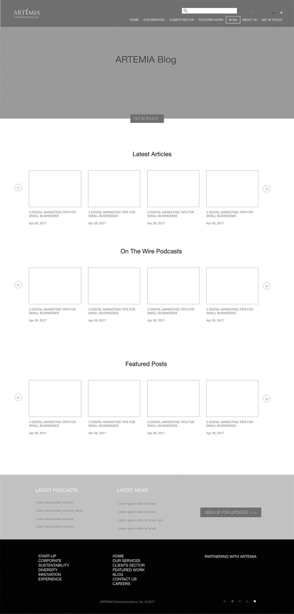
Blog
Reflection
I was genuinely surprised to see how many users were having struggles trying to find information about digital services. So I created and added iconography to the design, making the content fluid, and easier to read. This tested to be much more effective with users. Responsive development for a digital service agency is both complex and fun!