Table of contents
- Table of contents
- The problem definition
- The user research
- The design solution
- The design process
- Reflection
The problem definition
Dealing with online direct sales should be simple and fun. How to do demonstrate it through a website?
Ruby Ribbon is a Silicon Valley-based apparel company known for selling shapewear and fashion through Independent Stylists, as a direct sales business.
My first priority was to make Ruby Ribbon's website responsive and more accessible, and of course applying contemporary e-commerce features.
The foundation for this project was based in user research and tests.
The user research
Real clients/stylists, fashionistas and potential clients.
I started with a survey and applied it to 18 people (including current clients/stylists, employees, potential clients/stylists and fashionistas) to better understand the experience they have while accessing Ruby Ribbon’s website.
Facts I comproved:
A) Not a mobile-friendly website
95% of the interviewed complained about features not working on mobile platforms.
B) Poor e-commerce structure
90% of the interviewed didn't like the structure of the website. They think it’s difficult to buy and find products on the website.
I also performed an observation test including 10 different profiles (current clients/stylists, employees, potential clients/stylists and fashionistas) to understand their behavior while going through Ruby Ribbon’s website.
Facts I discovered:
A) Outdated visual
89% of the users thought the website didn't match with the products the brand sell, since the main products have high technology on the garments/shapes.
B) Complicated flow
94% of the users took a long time to find the product they wanted and as well as finding correctly the prices and sizes available.
C) Missing information (and opportunities) about the products
89% of the users wanted to see information about the garments, technology and reviews about the products. 90% of the users asked for related products and suggestions to buy.
The design solution
A responsive and fashionable website, easy to find and buy products.
The goal of the project is to drive more clients and sales through the website, creating a responsive layout, adjustable to multiple platforms.
The design process
- Content: Cleaned the menu, deleted a few non-essential pages and adding others.
- Layout: A fashionable and elegant design, matching with the brand concept and technology.
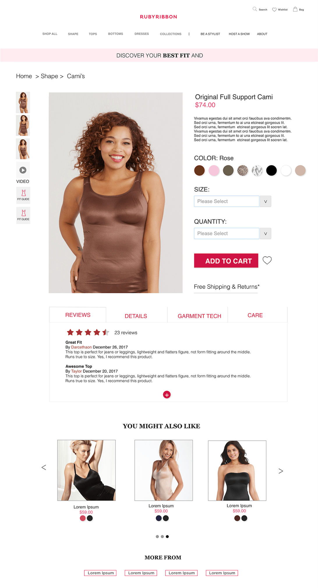
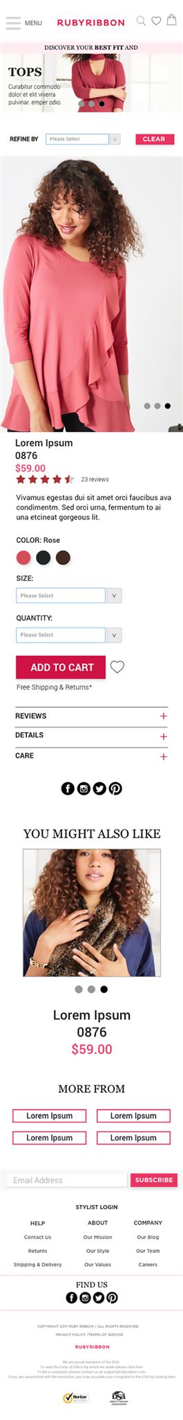
- E-commerce: Revamped the PDP pages, added simple e-commerce features, resulting in a better shopping experience.
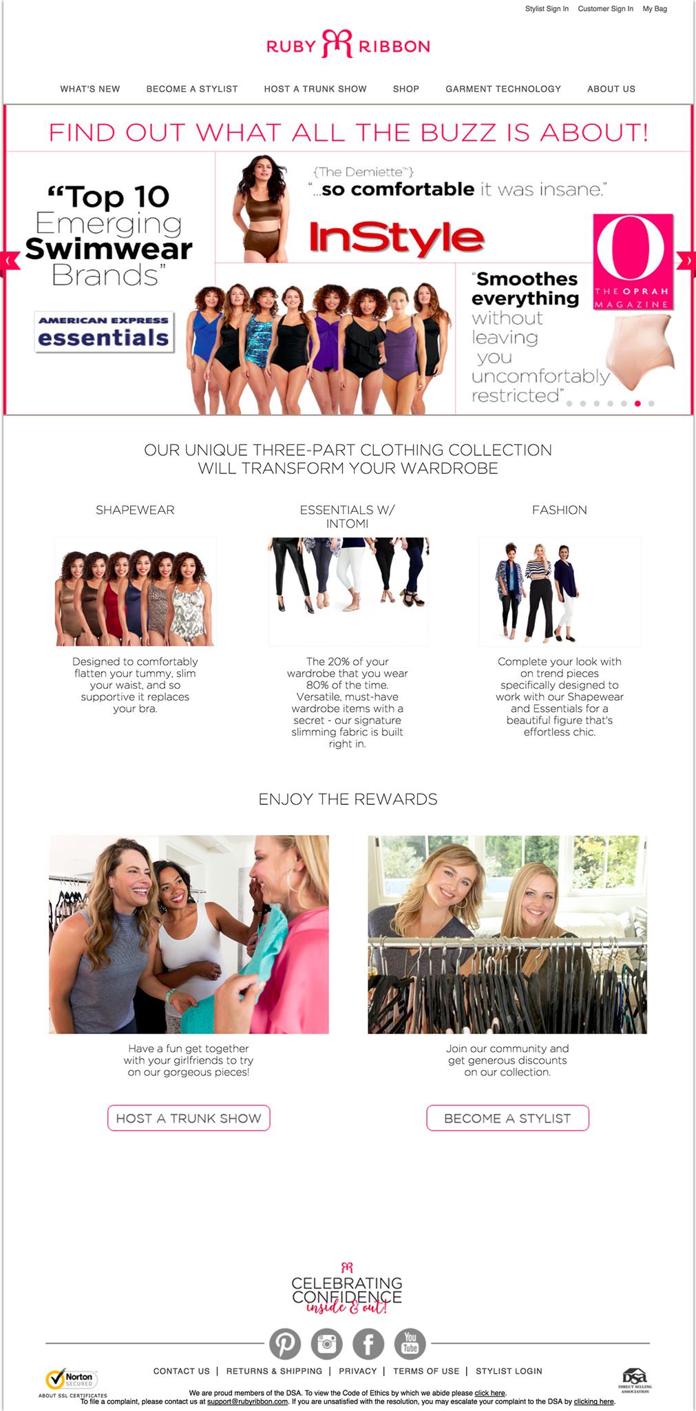
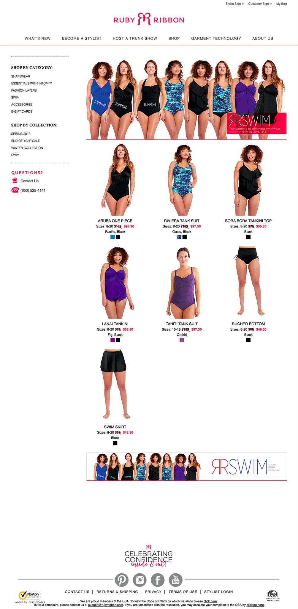
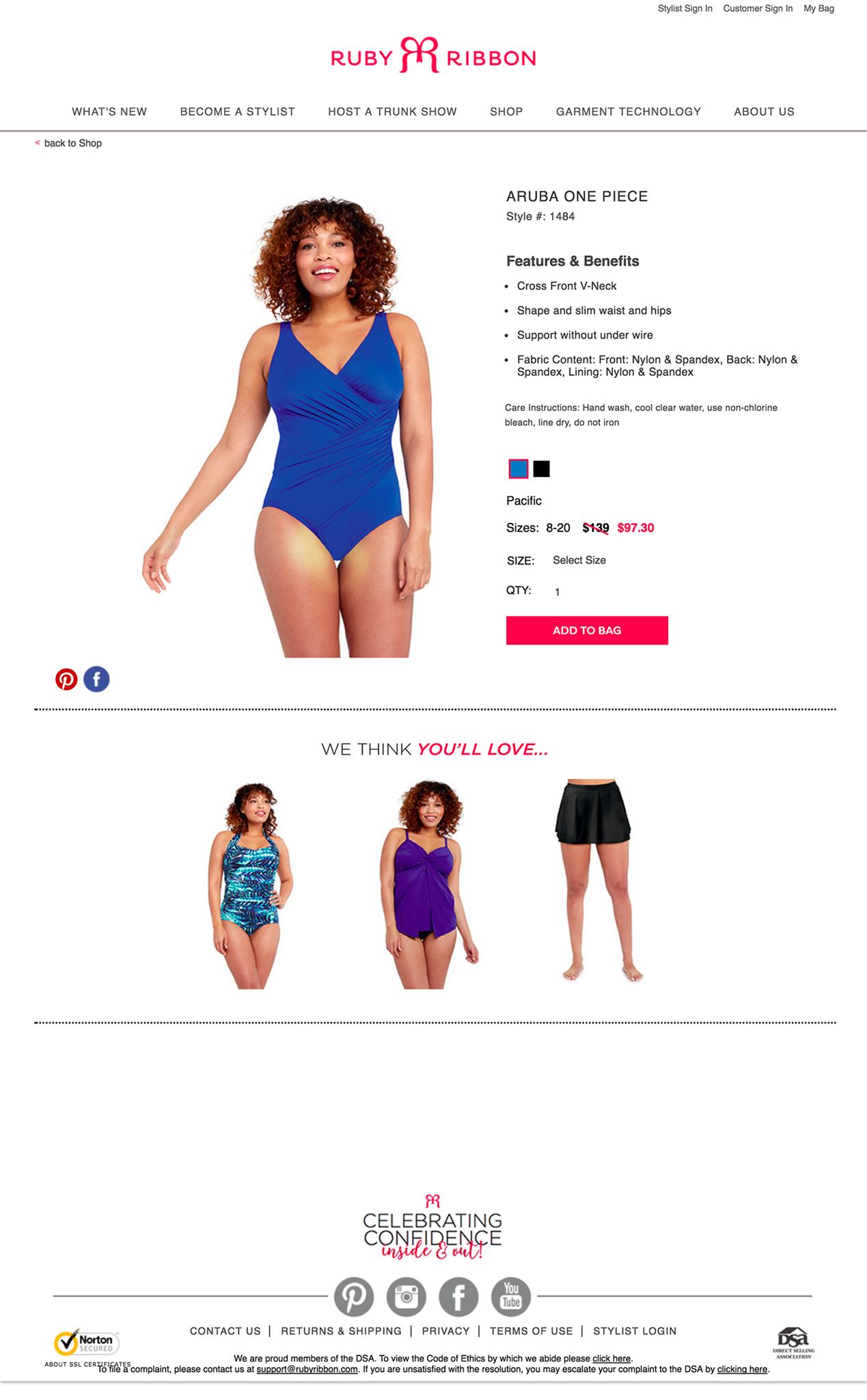
The current website
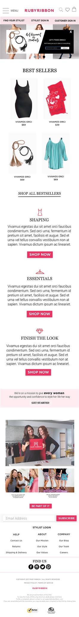
Home page
Category page
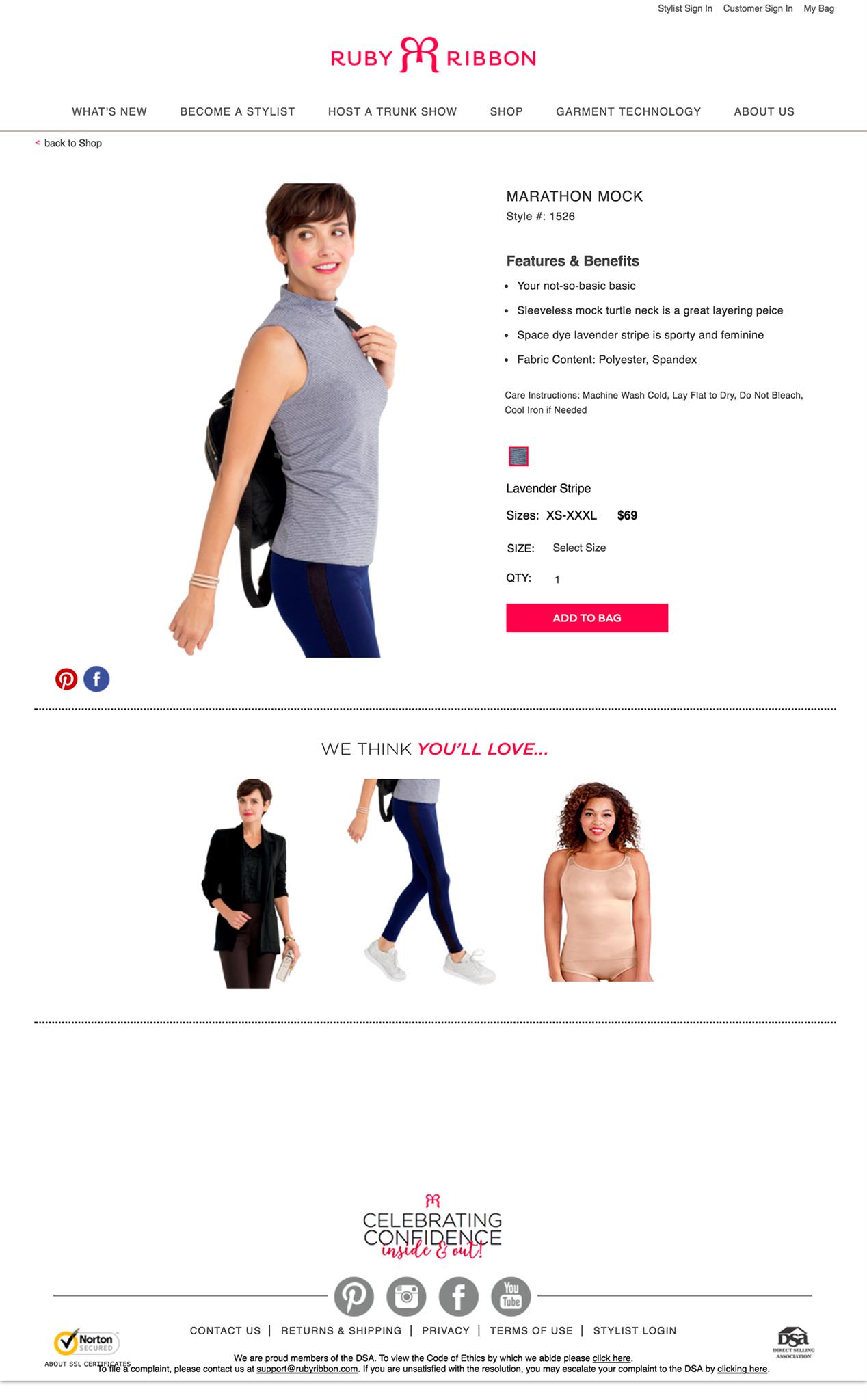
Product page 1
Product page 2
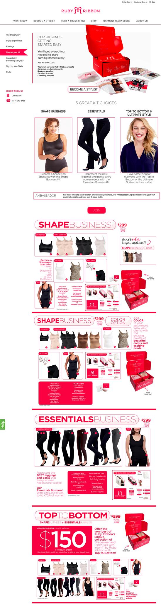
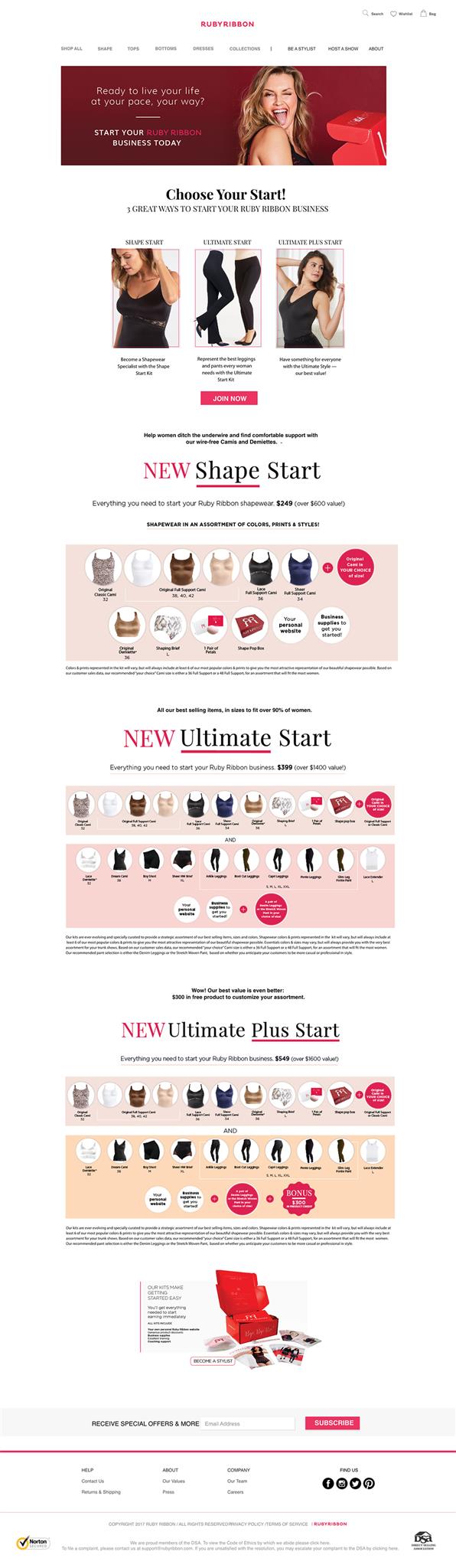
Choose your Kit
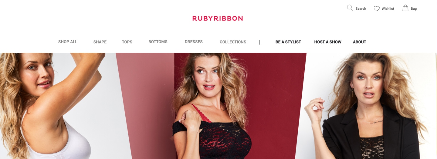
The proposal
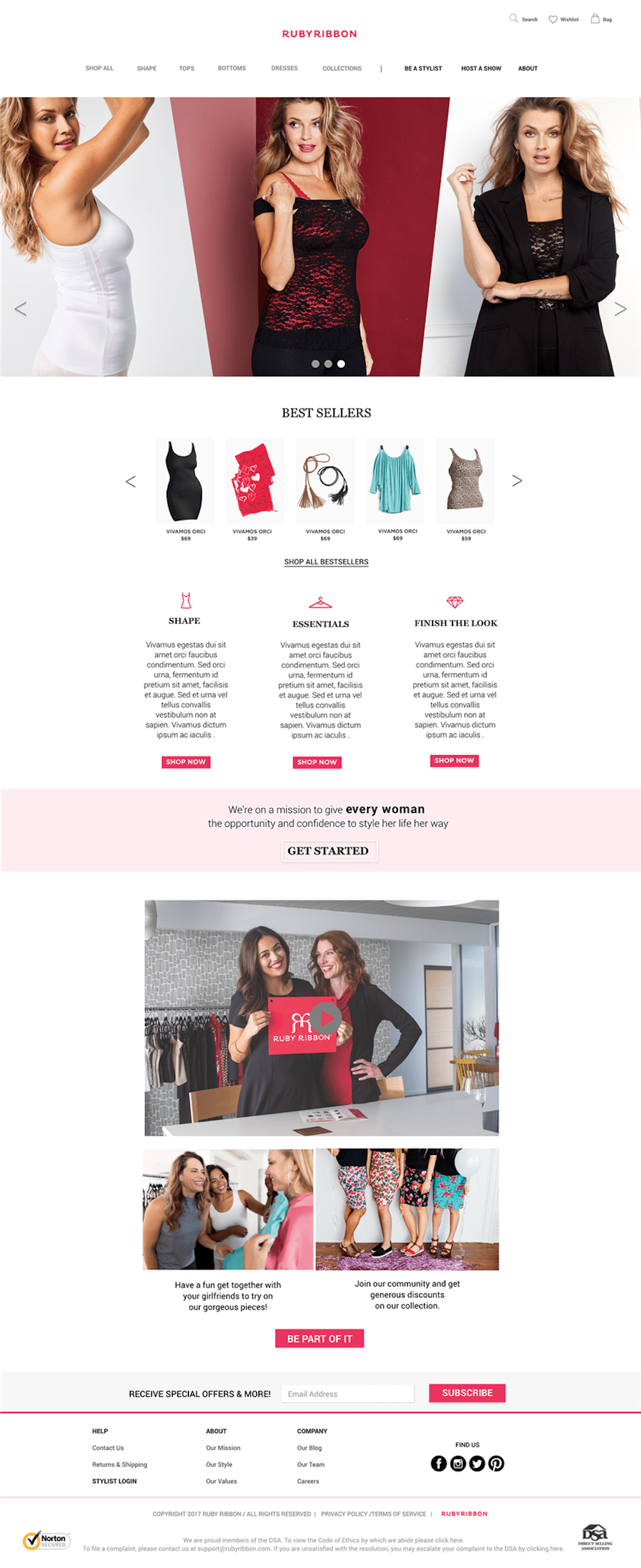
Home page
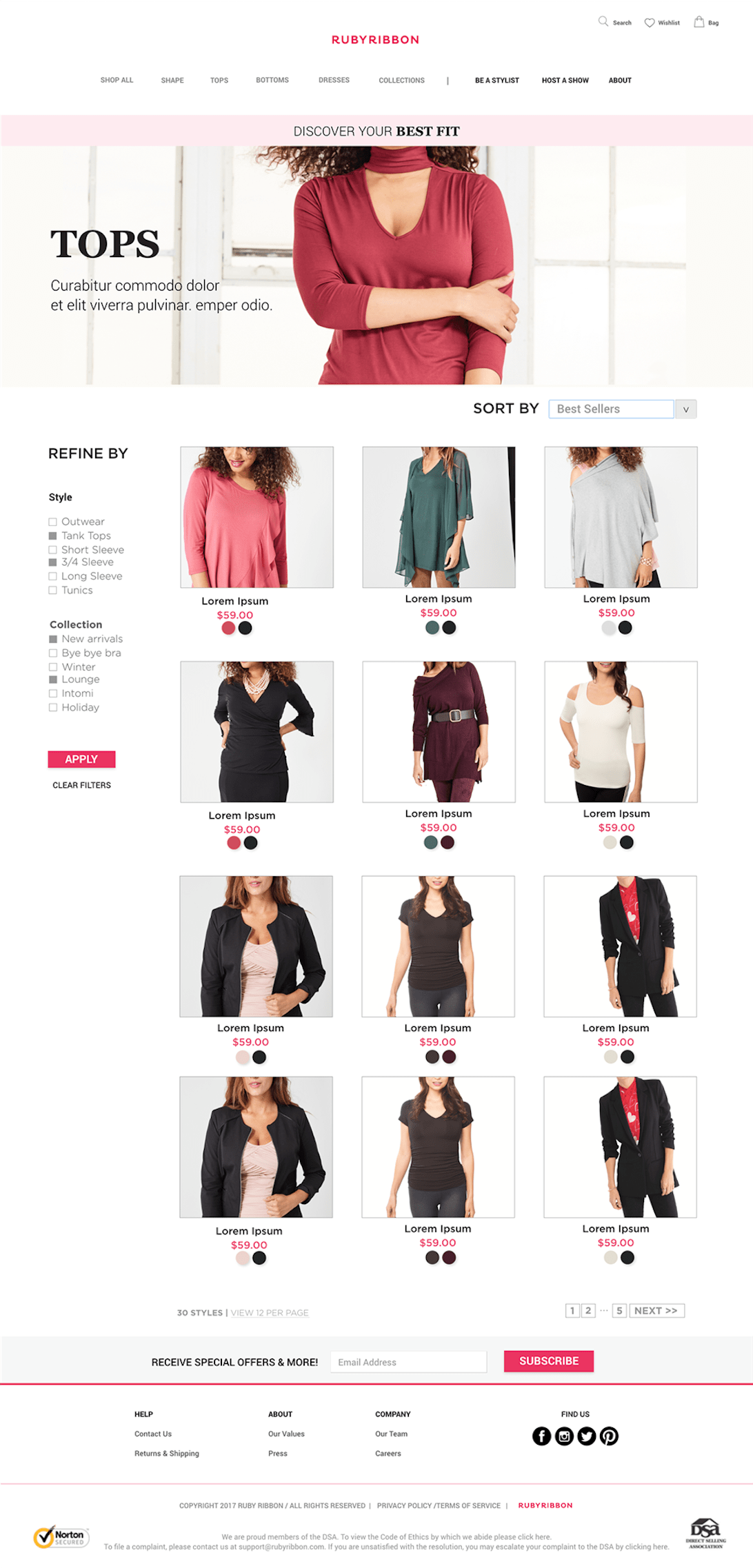
Category page
Product page
Choose your Kit
Home page (mobile)
Category page (mobile)

Product page (mobile)
Reflection
I was surprised to see how many users had struggles accessing the website through smartphones and tablets. So we focused on mobile-first concept, making the content suitable for multiple platforms. The tests were successful, now the company is ready for the next phase of the project.